a img { display:none; } a:hover img { display:block; } -->
Showing posts with label Review. Show all posts

Wednesday, January 14, 2015

Book Review: Hockey Card Stories


http://www.amazon.ca/gp/product/1770411976/ref=as_li_ss_tl?ie=UTF8&camp=15121&creative=390961&creativeASIN=1770411976&linkCode=as2&tag=canarock-20

  Hockey Card Stories: True Tales from Your Favourite Players by Ken Reid was released in October of 2014.  I put it on my Amazon Wishlist and Santa was thoughtful enough to leave a copy under the tree for me. 
 This book is a must read for any hockey card aficionado, especially if you long for the old days when O-Pee-Chee was the dominate, and sometimes only, brand.  The author, Sportsnet's Ken Reid, picked out 61 cards from his personal collection and then called up 59 players on those cards to see what they thought of them.  The book is divided up into ten chapters, with each chapter featuring five to six players.  Each player's story lasts 4-6 pages.
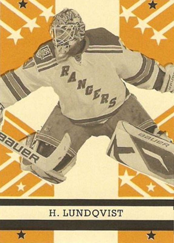
  The cards range from 1971 to 1991 -  all O-Pee-Chee.  There is a solid range of players, from HHOFers, such as Tony Esposito and Bobby Orr, to one game wonder, Bill Armstrong.  Player's reactions of their cards range between pride, to indifference.  Although most, especially the guys with the 1970s cards, expressed embarrassment over their photos.

An example from the WHA chapter
 
  The book read like a bunch of short articles, or blog posts.  In fact, some of the stories were previously published online a few years ago. Check them out if you want a sampling of what is in the book.  Most stories are directly relates to the card pictures, but a few seem to use the card more of a jumping off point to cover the player more in general. 
  One of the more interesting stories was the 1984-85 OPC Ken Linseman.  I alwasy knew it was an obvious airbrush job, but there is more to it than that.  It's Linseman's head, but not his body.  I will let you google it, or go out and buy the book to learn more. 
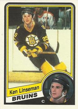
The FrankenCard.

  This was a very interesting book to read but it left me wanting more.  I have always wondered what players thought about their cards and what type of cards or memorabilia collections they might have.  Perhaps there will be a sequel.  I do hope so.
  I definitely recommend this book to any true hockey card fan.  There are no stories about game-used jersey or serial numbered cards, so perhaps not a great buy for anyone who has never ate gum from a pack of cards.  It has a $19.95 cover price but, as always, can be had for cheaper online.  Let's finish with a word from Ken Reid himself.


Friday, September 14, 2012

Box Break: 03-04 ITG Toronto Star


  The 2003-04 ITG Toronto Star set was available in the Greater Toronto Area.  For those of you who do not live in the centre of the universe, the Toronto Star is a daily newspaper.  Dave and Adams had boxes for $10, so I threw one on to my order.  The one thing that struck me immediately was the suggested retail price of each pack - $3.49!  For 4 base cards and a foil insert.  I got 20 packs for $10.  I saved $60 by waiting 9 years to buy a box.  Lets take a look at the base.


  I don't card what A Pack a Day says, I like the base a lot.  A nice full body picture of the player, team logo in the top corner and a single bare across the bottom with set logo and player name.  I find the front of the base cards to be very simple and attractive.  The backs are okay.  A single year of stats and a brief blurb on the player.  The head shot on the back is from the same image as on the front.  What I couldn't find was what position the player was.  For some reason, I feel that detail is a must on every hockey base card, especially the low end sets. I got bit lucky with my box and one pack had an extra card.  So I ended up with 81 of 100 cards.  The collation was not random.  I'd have 8-9 cards and then need the next two and the pattern would continue. 


  I like the foil cards as well.  Full body with head shot in background all wrapped up in a shiny package.  The foil cards is a 30 card set.  Although I have to admit I didn't get to see any foil cards other than Joe Thornton.  Every pack had a Joe Thornton foil card.  In fact, there is a small picture of him on the box.  Seriously, who is the joker who thought that up?  So I have 19 Joe Thornton foil cards available for trade.

  Even with the Joe Thronton debacle, I like this set.  A low risk, low reward box, but it scratches the itch.  I think it'd be a good TTM set as well.  No buyer remorse on this one.

Although I still need 19 base cards.  Looking for the following.
#Player#Player
1Jean-Sebastien Giguere60Eric Lindros
2Petr Sykora65Jason Spezza
11Ryan Miller66Marian Hossa
20Alex Tanguay75Evgeni Nabokov
29Brendan Shanahan76Pavol Demitra
37Mike Comrie85Martin St. Louis
38Ryan Smyth86Owen Nolan
46Marian Gaborik96Markus Naslund
47Manny Fernandez97Todd Bertuzzi
59Anson Carter

Wednesday, October 5, 2011

11-12 OPC Retro and Legends

  The 2011-12 OPC set has hit the streets.  I was browsing some blogs and came across a box break on Just a Bit Offside.  There are two things I have look forward to seeing when OPC is released, the Legends and the Retros.  So far, I am a bit disappointed in both.  
  While it is great to see Ron Francis in a Whalers jersey, or Legends Tony Tanti and Tim Kerr make the set, the design is getting worse.  A lot of that is thanks to the overall set design and the reduction in picture space.  At least the Legend cards don't have the over-sized OPC logo, instead they have an over sized Legends tag.  In 09-10, the pictures where mostly full body shots.  In 10-11, the pictures where mostly waist-up shots.  In 11-12, the pictures are head shots.  Every year there is less action in the photo.  I'll likely still try for the Legends subset but I'll be in no rush to complete it.
  As for the retros, I find them bland.  I think they'd look better with a colour picture of the player.  Ideally a really bright and vivid picture to contrast the dull background.  I made up a pair to compare the difference.  


Yes, I do think they'd look better with a vivid colour picture on the front,  most likely even better if professionally done.