
The 2011-12 OPC set has hit the streets. I was browsing some blogs and came across a box break on Just a Bit Offside. There are two things I have look forward to seeing when OPC is released, the Legends and the Retros. So far, I am a bit disappointed in both.
While it is great to see Ron Francis in a Whalers jersey, or Legends Tony Tanti and Tim Kerr make the set, the design is getting worse. A lot of that is thanks to the overall set design and the reduction in picture space. At least the Legend cards don't have the over-sized OPC logo, instead they have an over sized Legends tag. In 09-10, the pictures where mostly full body shots. In 10-11, the pictures where mostly waist-up shots. In 11-12, the pictures are head shots. Every year there is less action in the photo. I'll likely still try for the Legends subset but I'll be in no rush to complete it.
As for the retros, I find them bland. I think they'd look better with a colour picture of the player. Ideally a really bright and vivid picture to contrast the dull background. I made up a pair to compare the difference.

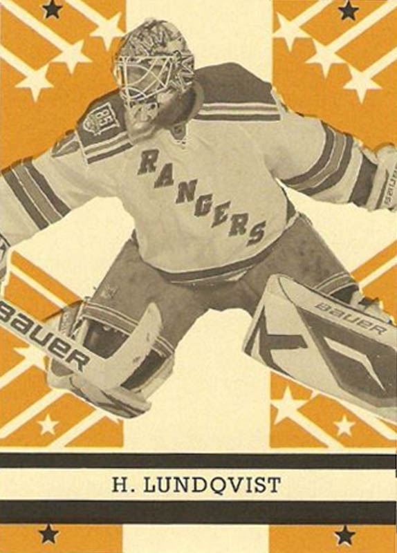


Yes, I do think they'd look better with a vivid colour picture on the front, most likely even better if professionally done.
Hate the base design for sure, but like the retros for some reason. I see what you're saying about the color photo, but there's just something I like about the way they are.
ReplyDeleteI'm with Paul on this one. I enjoy the black and white pictures; gives it that old timey feel that I THINK they are going for (but who knows with UD).
ReplyDeleteThe stars on the top and bottom look punched out, which I assume is not the case. However, I think it'd look cool with a little punched out action.